Brand Building · 4 min read
Logo Design Essentials: Crafting a Memorable and Timeless Brand Identity
 By Adrian Martinez · · Updated

On this page
Getting your Trinity Audio player ready... |
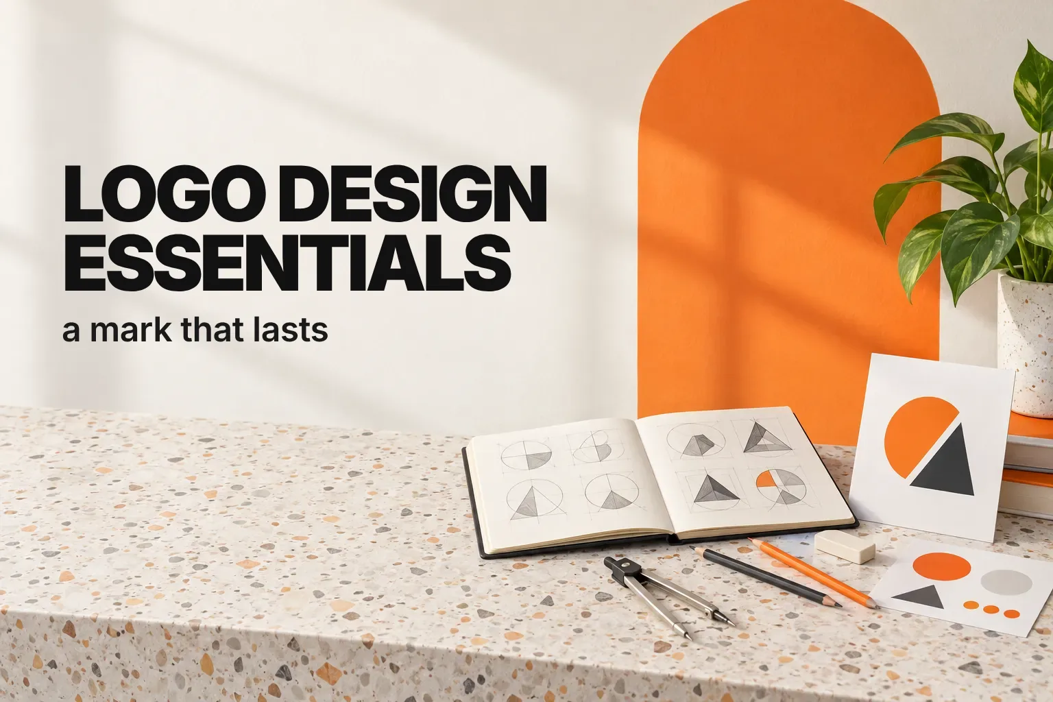
A well-designed logo helps people recognise your business across your website, proposals, signage and social profiles. Effective logo design combines a clear idea, legible typography, appropriate colour and files that work at the sizes you actually use. A logo is one part of your brand identity; your service, messaging and customer experience also shape how people see you.
Start with a useful logo design brief
Before choosing colours or drawing symbols, define the business, its audience and the impression the identity should communicate. A useful brief answers these questions:
- What do you offer, and who is the priority customer?
- Which qualities should the identity communicate, and why?
- Where will the logo appear, from a small website header to print or signage?
- Which existing brand elements need to stay?
- Who approves the design, and what are the deliverables and timeline?
Review competitors to understand the category and avoid visual confusion. Use references to explain a direction, rather than asking a designer to copy another business.
Five principles of an effective logo
- Simplicity: Remove details that do not help recognition. Simple does not have to mean generic.
- Relevance: Choose a style that fits the business and audience. The mark need not literally illustrate every service you offer.
- Clarity: Check that the business name and symbol are legible without an explanation.
- Scalability: Test the artwork at small and large sizes. Fine lines and tightly spaced lettering may disappear in small applications.
- Versatility: Prepare versions for light and dark backgrounds, single-colour reproduction and different layouts.
Choose a logo style that fits its use
- Wordmark: Uses the business name as the main design. This can help when introducing a name that customers do not yet recognise.
- Monogram or lettermark: Uses initials. A compact mark may suit small spaces, but new audiences may still need the full name nearby.
- Pictorial mark: Uses a recognisable image or object. Check that the imagery is relevant and sufficiently distinctive.
- Abstract mark: Uses a non-literal shape or composition. Its meaning can develop through consistent use alongside the business name.
- Mascot: Uses a character. Consider whether that tone suits the audience and whether the illustration works at small sizes.
- Combination mark: Pairs a name with a symbol, allowing several arrangements for different applications.
Minimalism is a stylistic approach, not a requirement. Choose the direction by how well it serves the brief, rather than by a passing trend.
Use colour, typography and symbolism deliberately
Colour associations vary with context, audience and culture. Avoid treating any colour as a universal promise of trust, luxury or growth. Compare palettes in realistic applications and check visibility against the backgrounds you use.
Typography should support the intended personality while keeping the name readable. Compare letter spacing, similar-looking characters and the smallest planned size. Confirm the licence for any font used in the finished identity.
A symbol can suggest an idea or value, but it should not require a long explanation to function. Test whether people can distinguish the mark from other businesses in your category.
Test the logo before approving it
- Preview it in your website header, a social avatar, a proposal and a typical printed item.
- Check a small version, a large version and a single-colour version.
- Compare light and dark backgrounds.
- Ask a few people in your intended audience what name they read and what impression they get.
- Review feedback against the brief, then refine spacing, proportions and legibility.
Ask focused questions instead of relying only on whether someone likes the design. Check what they can recognise and whether the identity suits the intended business.
Agree on the handoff files and usage guidance
Before work begins, confirm the final file formats, ownership terms, revision rounds and any third-party licences. Depending on the project, a handoff may include vector artwork for scalable use, transparent raster exports, horizontal and stacked versions, colour values, minimum sizes and clear-space guidance.
A short brand guide helps your team use the same identity across the website, email signatures, social channels and printed material. Keep a master copy of the approved files and avoid stretching, recolouring or recreating the logo from a screenshot.
Frequently asked questions
Is a logo the same as a brand identity?
No. A logo is a recognisable mark. A brand identity also includes elements such as colour, typography, imagery and the way the business communicates.
Should I use a template or commission a custom logo?
A template can offer a quick starting point, but check its usage rights and how widely the same design is used. A custom process provides more scope to develop a direction around your own brief, audience and applications.
Can a logo guarantee more sales?
No. A clear, consistent identity can support recognition and presentation, but sales also depend on the offer, demand, service and customer experience.
Plan your business identity
If you need a logo that works with your website and wider brand, explore my branding services. Request a quote with your business name, audience, existing materials and planned uses so we can define a suitable scope.
Keep reading
More on Brand Building.
Rebranding Strategy: 5 Steps to Revitalize a Brand
A five-step rebranding strategy for small businesses: decide rebrand or refresh, set the foundation,...
How can brand extensions leverage existing equity?
Today’s market is highly competitive as companies constantly seek avenues to expand their reach...
How Does Branding For Small Businesses Drive Growth?
Are you all set to explore the perfect branding for small businesses? Excellent decision! Establishing...